My first guest Blogger~ Brian Patrick Flynn on Upcoming Trends for 2010
10 best design suggestions for 2010
1.the black and white trend
many of my favorite showrooms are introducing fantastic new black and white prints. what i have always loved about black and white is its staying power. the addition of one bold color really takes it in a completely different direction. lately i have been drawn to black and white paired with hot pink, kelly green or navy blue. classic but bold.
2.finding the good of the 1980's
the majority of the eighties should stay hidden in the past BUT there are a few 80's elements that have been reinterpreted. grey and purple were huge in the 1980's but the newer hues they're popping up in are much more regal and much less Crockett and Tubbs. black lacquer is another element that i welcome when used in moderation. i recently shot an episode of movie and a makeover at the New York Design Center and fell in love with.....[gasp] BRASS fixtures! some faucet manufacturers are putting out styles in a satin brass finish. its just one step above matte and comes in a golden tone that really puts a new spin on something dated.
3.grasscloth
grasscloth is becoming more mainstream again. there are so many options out there from rich textures, vinyl that looks like grasscloth with more durability to embroidered or stenciled patterns. it ranges in price depending on where you're looking. my brother-in-law just did his summer home in the Bahamas on a super tight budget using styles from a discount wallcovering site called www.papermywalls.com. a great place to turn for inspiration is tv! two hit tv shows have grasscloth on their sets : brothers & sisters [the home of sally fields' character] and better off ted [the office of portia de rossi's character].
4.high and low
mixing high with low creates the perfect balance. given the state of our economy, it makes more sense now than ever to stretch your design dollars as far as possible. i usually splurge on sofas, art, draperies and beds; however, I purchase almost all my coffee tables, end tables, lamps and pendants at flea markets and thrift stores. my favorite retail store for sofas is room & board. z gallerie is my go-to retailer for plush throw blankets and i also love the scale of most of their accessories. JCPenney for the home has some decent pre-fab drapery panels that come both pleated and lined at a fraction of the cost of custom draperies. then there is IKEA which is an art form in itself. every space i have ever done has some element of IKEA in it but you have to be really strict about your choices. their traditional and transitional style furniture is what i look for the most.
5.glamour used sparingly
kelly wearstler really did a lot to make design innovative and experimental for the young design generation. she made us rethink the way we see glamour. every space i do has some glamorous element to it but its not in your face. mirror is totally hollywood but to keep it from going over the top, i like to use it sparingly either just atop a coffee table or on an accessory such as a tray or an obelisk. black is also super glamorous but not the most practical for upholstery. many times i will use black on the walls in the form of paint or wallpaper....or just on trim. another iconic element of glamour is the chandelier. i use chandeliers anytime i have the opportunity. they're great when installed in unexpected places such as closets or over beds in guest rooms.
6.the equestrian trend
for some reason, i'm drawn to the line and graphic impact of the horse. many of my clients are as well. equestrian fashion was a huge trend on the runway about five years ago. there's something strong and timeless about them and they make for great subject matter in art. atlanta artist bonnie beauchamp cooke has the most exquisite equestrian art i've ever seen. you can check it out at www.beauchamp-cooke.com or visit huff harrington gallery on roswell road.
7.organic textures
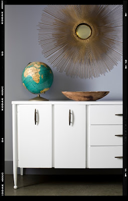
organic blah blah blah blah. the word is thrown around so much that i sometimes want to just eat a case of spam and douse my noggin in aerosol hairspray simply to buck the trend. but there is something to be said about organic textures when it comes to interiors. they really add a warmth and richness to a room. if i'm using a super sleek modern chrome table, i will accessorize it with a rustic wooden bowl and old cloth covered books. when it comes to upholstery, i am a huge fan of linen. when backed correctly it can add a casual upholstery element to any style sofa or chair. aside from grasscloth, i'm a huge fan of covering walls in raw silk.
8.tailored and inverted box pleats
i would rather live with bare windows than stick up simple retail rod pocket or tabbed curtain panels! its total snobbery, i know and i embrace it. one of my five favorite interior designers, betsy burnham www.burnhamdesign.com introduced me to the magnificent inverted box pleat nearly a year ago. its a selling point to male clients hesitant to invest in draperies. there's something about that particular pleat that is more masculine than others. in my own home, i usually stick with the tailored pleat as i love how the ripples cascade down from the tiny center point at the top. for those on super tight budgets, i suggest purchasing IKEA drapery panels and a bolt of black out liner, then dropping the panels off to a seamstress to customize. although you're still spending money on labor, your saving a ton of money on fabric since most IKEA panels come in pairs for around $30.
9.grey
this has been a trend for a few years now but i think grey is here to stay for quite a while. taupe is now beige in comparison. grey is so versatile that it can work with just about every color. my entire mid-century modern home is done in shades of grey paired with violet [main floor], red [guest room] and red-orange [bottom floor]. the ultimate neutral pairing that i am madly in love with is silver-grey with black-brown. its super masculine but has a glamorous edge to it.
10.farmhouse chic
one style i will always hold high above others is farmhouse chic. its a pretty big trend with restaurant design lately -- especially in atlanta -- but there are so many practical elements to it that i hope its here to stay. the rustic textures are forgiving and warm -- great for families prone to accidents. the simple lines of the farm table or ladder back chair are transitional enough that they work beautifully when paired with something more modern. lastly, the overall family element of farmhouse makes it ideal for people who love to entertain.
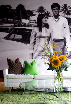
Brian is a fan of huge statements through photography. This photo [from Oprah at Home magazine] shows how Brian blew up his favorite image on billboard vinyl to turn dead space into a huge personal focal point.
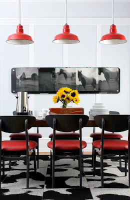
Vintage is king in almost all of Brian's spaces. This dining room was done on a teeny budget but you can't tell due to clever pairings. A Decatur antique store had the farmhouse chic pendants on sale for less than $40 apiece. Brian spray painted them red and added longer conduit to conceal the old wires. He found the mid-century Danish chairs at a flea market for $80 and had them sprayed with charcoal lacquer then added new red vinyl cushions to complement the lighting above. Walls painted in a muted blue-grey [Billowing Clouds from Porter] made the original millwork standout in high gloss white. Photography plays a part here as well with equestrian art by Sarah Dorio mounted behind Plexiglas. A modern IKEA table and a FLOR area rug [in Rawhide] are the only brand new design elements in the space.
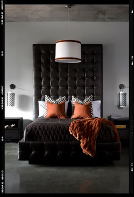
Brian's client, a news anchor, wanted his master bedroom to feel chic and modern with color but not too much color. He painted the walls in a light grey tone to keep it light and play up the dark grey tone of the concrete floors. The client was okay with spending more on a custom bed [designed by Brian] but wanted to keep costs low on tables, lighting and bedding. Target's Thomas O'Brien coverlet was less than $100 thus allowing Brian to splurge on David Hicks La Fiorentina fabric on the throw pillows.
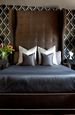
When it comes to bedrooms, Brian likes to make sure the bed itself is the breakout star. He designed this super tall bed to resemble the look of a traditional wingback chair. To take focus off the sloping ceiling, he papered the walls in a geometric wallpaper [Lee Jofa's "Pompeian"] which ties in perfectly with the color scheme of grey, dark brown and silver.
Look for more Style Chat with great style advice from me for real people/real homes + more design gurus coming your way....lots of cool surprises.
