This
killer kitchen renovation featured in this month's
Better Homes and Gardens was such a fun styling job. I love the beams, pops of green, and industrial black lights. Don't you? I'm loving the mismatched islands that I'm seeing everywhere. For this home they chose a distressed mint green. Very on trend.

The renovation allowed the homeowners to open up there once closed off kitchen into the living space. The end result is airy and warm all at the same time and a perfect space for entertaining. The room felt huge with several areas for gathering which I really love. They wanted a more open concept and they definitely achieved that.

The bumped out breakfast wall made room for custom built-in benches and plenty of seating. The farmhouse look is completed with the cow painting by local artist
Amy P. Collins. So great. The view is not so bad either. A perfect spot for catching up on your blog reading. Have any new ones you're loving these days?
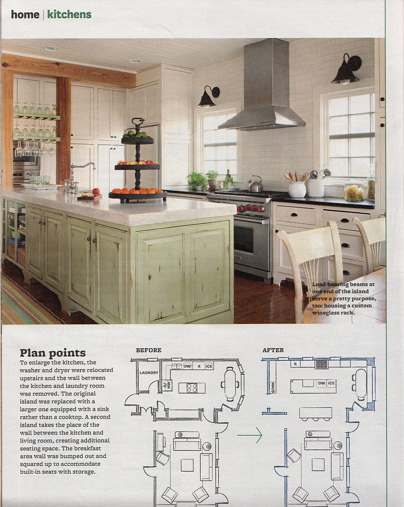
I thought the custom wine glass rack between the beams was a really cool touch. As far as styling goes, I played up the green with limes and complimentary colored fruit (like the oranges). For the florals I went with simple white daisies in a rustic ceramic vase and gorgeous overflowing white tulips in the living area. I set the table with stacks of plates and french blue linens. All keeping with the farmhouse theme. If you have any questions about styling of any of my projects please don't hesitate to ask. I'm happy to answer! Happy Monday!On newsstands now.
photos by edmund barr